When looking at the brief of the Final Project, it was clear to me that it would be best that the project reflects the discipline that I will be studying next year, that discipline being Visual Communication. This meant that whatever I created or produced for this final project would have to visually communicate something through the use of media, advertisement, posters, cards, books etc. So I began to brainstorm 3 main ideas that I knew I could build on (see image below), these ideas were; a book, a zine and a collection of posters. Each idea would grow from a particular materialisation's from the previous project, these were mainly materialisation's 7, 8 and 9.
After consideration I decided that the Book would be a good idea to build on as it would offer more complex solutions and design ideas than that of the zine or poster and would also present a challenge as it is something I have not attempted during this Diploma thus far. The materialisation that the book would be building on is the 8th materialisation, which focuses on femininity and the taboo topics that comes with being a woman such as periods and sexuality.
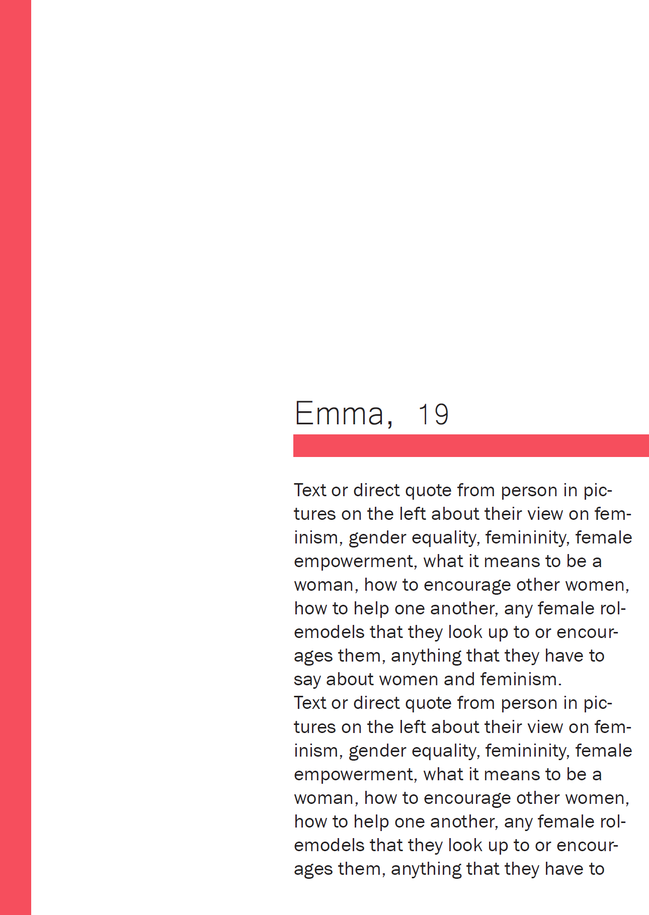
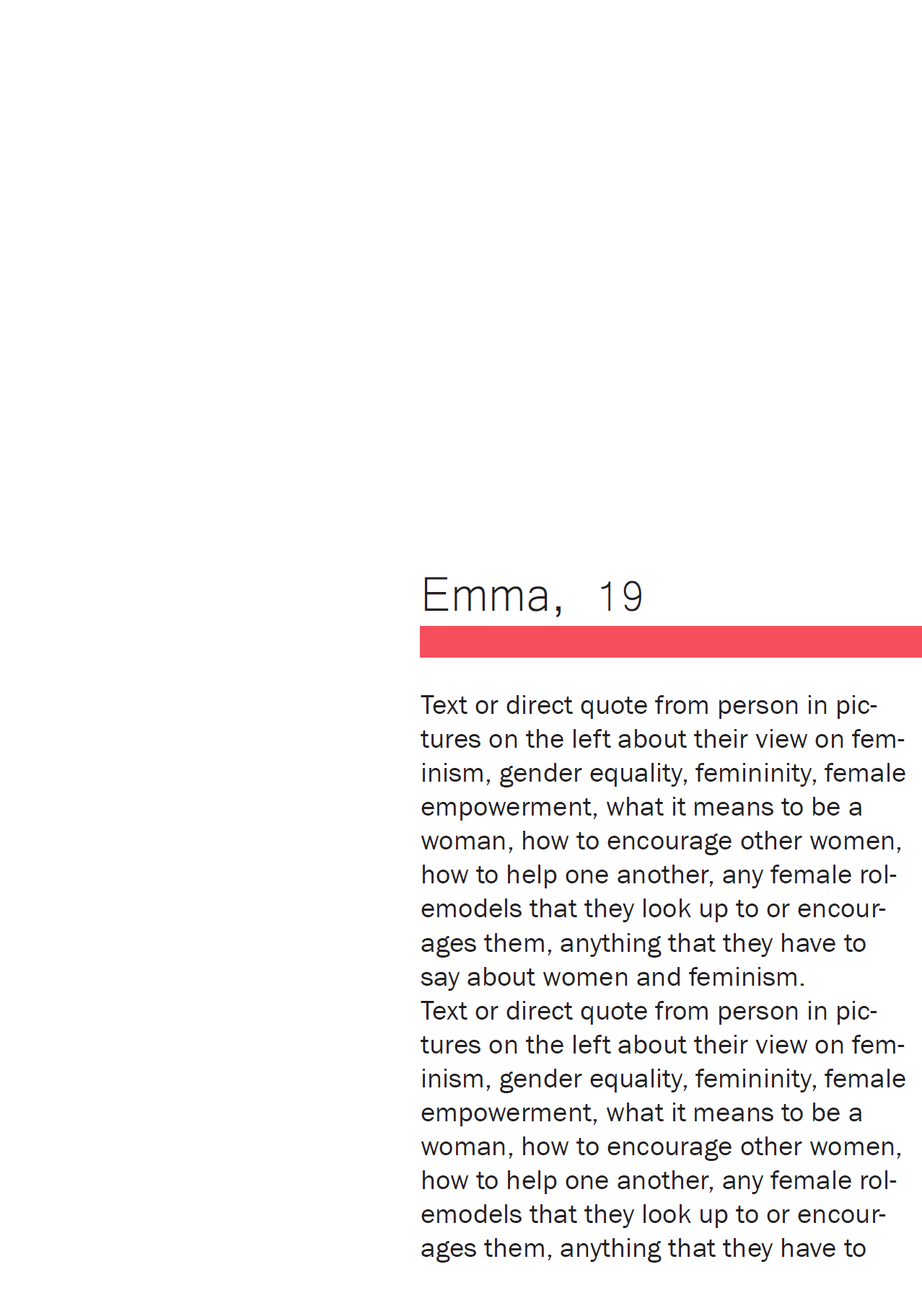
I wanted to allow for the overall aesthetic and theme from the materialisation's to carry over into this final project whilst also building on to it, allowing it to grow and become a more professional and modernist aesthetic. This will be done through the continuation of the grey scale images and with a pop of red through out the book. The photographs used in the book will be of girls and women of all ages in natural settings, all taken by myself so that the book can be as individual and unique as possible. With these photos will be a direct quote from the participants on what they love about being a woman, what it means to be female, their role models, the role that women play in the world and many other topics related to the feminist movement to lift up women world wide.
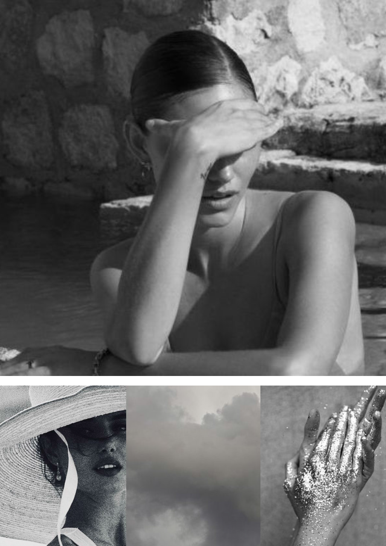
In order to gain inspiration and a sense of grey scale photography I decided to to do some research and create a mood board of grey scale images from all different angles and lens lengths, almost all with human figures in them as the participants will be the main focus of the images throughout the book.
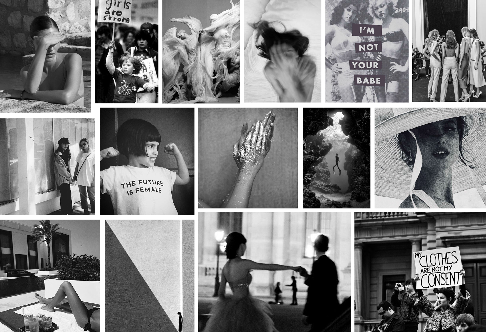
Mood Board compilation of grey scale images
The reason I want to use the colour red for the 'pop of colour' throughout the book is because when people think of the word female the colour Pink is often associated with them, for example, when revealing the gender of a baby at an event the parents will often use the colours pink and blue to symbolise the genders, with pink being a girl and blue being a boy. With Red being the cousin to Pink, I chose it as red is often connected to strength, anger and power, which contrasts to the 'girly pink' that society has connected to females. The red will act a symbol to show how powerful women are and can be.
Red is also a colour that reminds many of blood, specifically menstrual blood when connected to women. With menstrual periods and blood still being a taboo topic I thought it would be an interesting yet minute detail to add to the book as feminism and periods are both widely spoken about and both widely seen as taboo and as 'touchy' subjects.
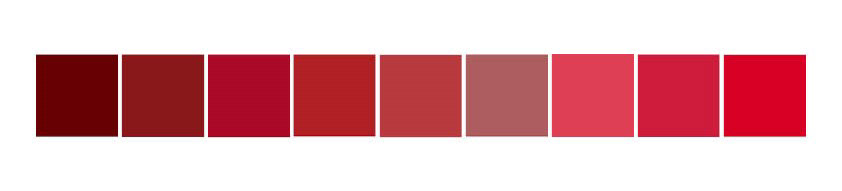
Pantone Palette Mood Board
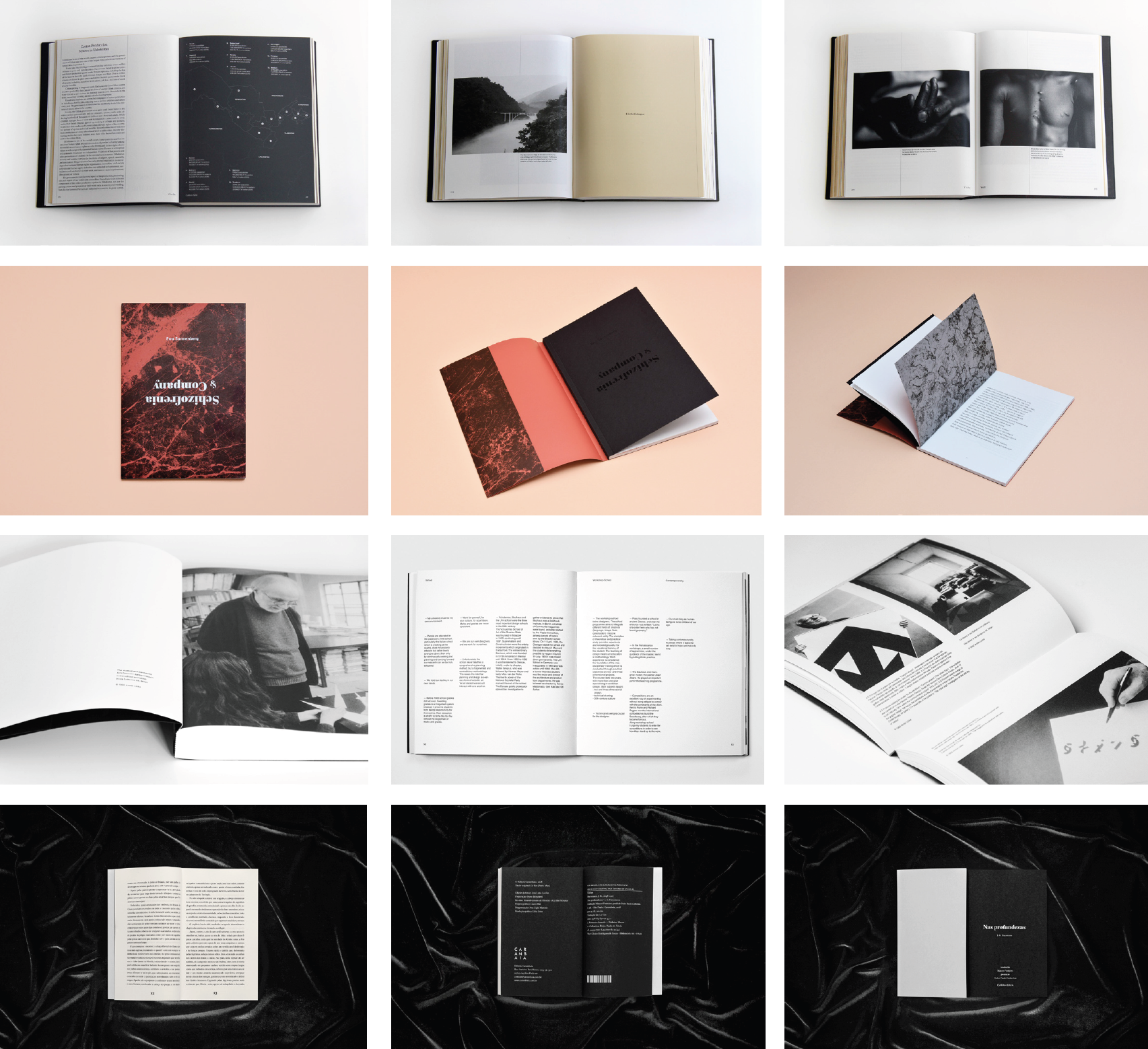
I then headed to Behance to gain some inspiration when it comes to modernist style books and photography. I created a small mood board of 4 different books that caught my eye the most and that I personally found the most aesthetically appealing.
The first row is a combination of images of the book 'A is for Abolitionism' (2018) created by Maria Villamil and Helena Corredera. The book focuses on modern slavery and seeks to inspire a new generation of abolitionists.
The second row showcases the book 'Schizofrenia & Company' (2018), created by Ania Światłowska, which contains a collection of poems about schizophrenia by Ewa Sonnenberg.
The third row of images is of the book 'A Lesson with A G Fronzoni' (2017), created by Daniele De Batte and ARTIVA DESIGN.
The fourth and final row of images is from the book 'Nas profundezas' (2018), created by Lucas Blat, which takes inspiration and references sacrilegious acts portrayed in the work of J.K. Hyusmans.
Font is to play a rather large part in the book as it will contain text on majority of the pages. It is important the text helps communicate the idea of strong and powerful women so in order to help gain an understanding I decided to test a few fonts that I thought may best suit the idea of the book (see images below) using the potential book name of 'la feminite', which is the french translation to the word 'femininity'. This is not the definite name of the book as of yet as much progression is to be made before a name suitable for the content can be chosen.
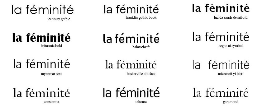
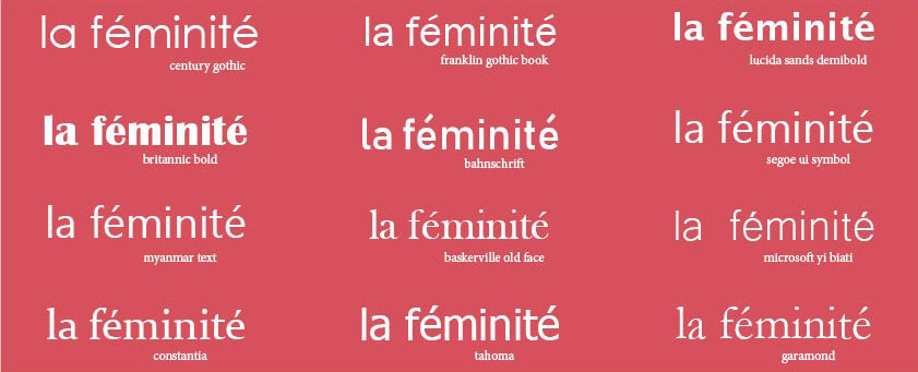
Images: font testing title of the book
When thinking about a modernist style of publishing, I had a certain image in my head of how the layout of this book could potentially look like. To best understand the image I had in my mind I decided to make examples of potential layouts using example images (see images below).

Layout example 1
When looking at this first layout, something felt slightly off about it, whether it be the way the images are laid out, the red stripe on the edge of the page or the font choice on the right page, there was something about this particular layout that was slightly off no matter how many times I changed the font or location of the red stripe. This specific layout will most likely not be used in the final production of the book.

Layout example 2
This layout in particular would act as a divider between the participants and aims to be impactful and bold, yet simplistic, with a singular image on the left hand side and a quote or phrase on the right hand side with the red encompassing the background. I enjoy the font used for the phrase, as it is strong without having to a bulky and bold font that is overbearing. This divider layout will most likely be slightly developed for the use of the book but will most definitely be used to help separate the images and interviews of the participants to add more depth to the book.
Layout Example 3
This layout is another example of the spread that may be used for the participants images and interviews. This layout is better than the previous one now that the red stripe on the edge of the right hand page has been removed and the images has been rearranged in a different order. Although it seems that the font is still slightly off putting and doesn't connect as well to the layout of the images or the message of the book, this font will need to be reviewed and further developed for the final product.


Layout Example 4
This layout would act as another divider between images and interviews, with the left hand side taking a dark grey background to contrast with the red page in the previous divider whilst also matching and complementing the grey scale images used throughout the book. The letter in the centre of the page will change each time the layout is used to form the word 'Female'. The right hand page will be a small timeline based around the fight for feminism with moments such as key events, role models, achievements for women worldwide and the fight for gender equality. The white background will contrast with the black page next to it with the thin lines in the background allowing it to differentiate from previous pages whilst also continuing a consistent theme and minimalist aesthetic.
What I Would Like to Achieve Next Week
Next week I am hoping to start making progress on the images and interviews of the female participants and research the timeline of feminism so that I may be able to add such information into the book in the divider and timeline pages to also make the book slightly informative.
I am also hoping to conduct research on the printing method that will be used to create the final product and the potential cost and how much time it will take to produce a clean and final print and how that will affect my progress throughout the next few weeks.